Saturday, January 14, 2012

One Fan's Favorites: ROYAL FLUSH GANG

The Royals get a lot of abuse as being cheesy or 'morts'
from folks who think their sensibilities are more refined.

Bearing in mind, of course, that we're talking about an
industry that revolves around colorful, fantastical, fictional stories.

I've always loved the RFG. Great concept, great
design, strong personal story.

Visually stunning, artsy, ever-changing, high-concept!
What's not to love?

Besides, I gave up my pretensions and concerns over
what others think some time back. It's popular to hate on the
simpler days, now. I'm over the trend.


Granted, the team has gotten a lot more fans since their
facelift/reinvent via the Batman/JLU cartoons of the
last decade or so. Maybe they work better in animated form?


Regardless, I love them in any form
(except probably stripped-down hodge-podge
'new 52 version', whatever that might be.)


The Royal Flush Gang; Everybody's gotta have a gimmick!

****************************

Thursday, January 12, 2012

George Perez Does JLA Right

An early and fabulous Marvel Comics' 'ersatz' version
(but still enjoyable) of DC's premiere group.
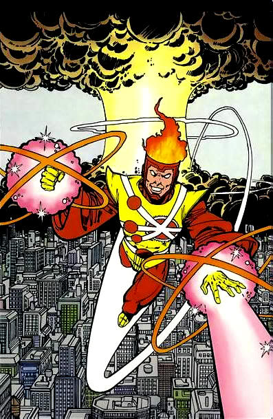
Englehart expanded on Thomas' "Squadron Supreme," a
doppelganger group of the Justice League,
beautifully rendered by a still-young Perez!
(From AVENGERS)


When George started doing JUSTICE LEAGUE OF AMERICA,
he was still in a fannish/cartoony period that was gelling.
Don't misunderstand; I LOVED his work, and his late-1970s/
early 1980s books filled me with excitement every time I
saw them. I may even 'prefer' some of the more
stylized comic style to the hyper-realism that developed.
But here he still had some consistency issues.
(Still, a 'bad' day for Perez is still a banner day for fans!)


George has such a deceptively simple, clean line style and
a real eye for characterization. He isn't just looking at
costumes and background (which he delights in
depicting with excruciation detail and design,)
but he gives history and introduction to his
characters through stance, expressions, and stature.
He's really a master.


But it doesn't stop there.
He does design work that lays out an entire
mythology within a few scant pages, or in a single
panel. His covers are bursting with dynamic struggle
and pathos. His post card series summed up entire
legacies. The economy of precision and detail.


Though Perez had an all-too brief run on JLA,
it was quite memorable.
He penciled two of the annual JLA/JSA crossovers,
 the origin of Red Tornado, the budding Zee/Barry romance,
and much more.


That era of the League was already a fan fave...
the Satellite-era League. It was a perfect combination
of characters in a perfect time in comics.
There were some superb stories being told from
some of the best in the craft.


Fan faves had a home.
You could still tell good, in-depth stories that
knew the difference between gravitas and depressing
deconstruction of a pass-time.


Yeah. Simpler times. Good times.


The Perez look on JLA gave that sense of being
larger than life, and yet realistic, all at the same time.
There was an added level of excitement to his work.
(No slight against some of the other greats, and certainly
not to one of my fave artists of all time, Mr. Dick Dillin,
the JLA artist mainstay prior to.)


It takes a special someone to not only deliver quality work
but be able to do it regularly and consistently....
especially when dealing with such a monster cast!


Not long after this run, on New Teen Titans,
Perez began developing a more finely detailed and
darker style. Still filled with a sense of fun,
but his JLA era work reflects a very particular
blend of all his best assets, for me.


And even though I love the fishnets, I also
loved Perez's more modern take on Zee.


Issue # 200 marked rather the end of an era.
Perez continued doing some covers that were still
stellar, but no more interiors. But the book started to
change, too. And this was the period that began the slow
lumbering crawl towards Crisis, and the first deathblow
to old school comics and fun.


But in homes, back issue bins, and now computers
across the world, the greatness of times past can still
be gushed over at any time.


Thanks for the gorgeous memories and legacy, George.
These books were the family and friends I didn't have
for a lot of years.

**************************************

Friday, January 6, 2012

INFINITY, INC.

(All artwork featured is by Jerry Ordway & Mike Machlan.)

(The team from Who's Who in DC Comics)

I was always a fanatic about DC Comics and Earth 2 in particular.
The JSA were a real favorite of mine, perhaps for the nostalgia--the sense
of history, longevity, originality, familiarity to the team.
Growing up in the 1970s, reprints of the Golden Age greats were
plentiful, and it was as if I had read about them all along.
(The All Star Squad and Power Girl were some of my
favorite characters!)

So when DC had Roy Thomas join together all the offspring
of the original JSA (the first time such an idea was done, I
believe,) I was ecstatic. This was a prime time to be collecting.
Between having the JSA active again in the present,
the excitement of new characters (especially kids a teen
could relate to,) and the tremendous art team, it was a
definite highlight of my comic reading experience!

(teaser from DC Sampler)

There was a lot to digest with such a huge cast and so much
history to play with, and this was back in the day when comics
(in particular Roy Thomas ones) were chock-full of dialogue
and a multitude of panels and story. You got your money's worth.
It was magical; You started with Jerry Ordway, and then some
Don Newton 'fill-in" issues, to be followed by Todd McFarlane
who--at the time--had a new and fun look that fit the book well!
I loved those crazy panel and page designs! (Later, there would be
phenomenal Michael Bair issues.)

(Specialty shop promo poster)

Alas, like most good things, it wasn't meant to last.
With pending changes due to DC's ridiculous and unnecessary "Crisis"
(which erased the Multiverse and decades of history and uniqueness,)
Infinity was one of the hardest hit books.
Everything Earth 2 was affected by the mess of Crisis, and the book
had to upend stories and characters to fit all the revisions in.
To be fair, Roy & Dann did a phenomenal job of making lemonade out
of lemons, but in the end you were still left with a bitter taste.

Infinity, Inc. ended up being one of those teams whose characters
and memory got a continual shaft, with deaths and limbo and
bad handling following the inevitable cancellation.
But I will always have great memories of all the issues
that gave me happiness those years ago. DC can't take
my memories!
As long as the back issues exist, the revisions and
editorial dictates of a corporation mean nothing to me.

R.I.P. Syl, Karen, Dick, Helena, Lyta, Hank, Yolanda,
Todd, Rick, Beth, Albert, Norda, Hector, Jennie-Lynn, & Bones!
You'll always be Infinitors to me!
Thanks to Roy, Dann, Jerry, Mike, Todd, and all the rest for
a stellar run and a lot of good memories.


******************************


Saturday, December 31, 2011

Flashback; 1977! FREEDOM FIGHTERS # 9


Bob Rozakis is The Man!

In the height of sensory overload and comic-y goodness,
this great issue showcases secret origins, loads of fight scenes,
revelations, treats, threatening smack-down dialogue,
cheesy twists, and tons of cliffhangers!

The Freedom Fighters were already big faves of  mine,
but the fever pitch of the series had me breathlessly
awaiting every issue! And Silver Ghost masquerading
as the hunky Americommando on that cover didn't hurt!
(courtesy of Rich Buckler & Abel.)
He's turning those KIDS against the FF, dammit!
What a cool, dynamic, well-laid out cover.

Interior art is superbly handled by Dick Ayers and Jack Abel,
and everyone is suitably heroic and defined.
This is what comics were meant to be!

Thanks for the great memories, guys!

*******************************

Wednesday, December 28, 2011

"It Was the Seventies"

"Say 'cheese'!"

The two made-for-TV specials from the Hanna-Barbera team
and NBC in the late 1970s, "Legends of the Super-Heroes", 
were live-action hoots that captured the imaginations of hungry
fanboys (and girls) at the time!

Like all things H/B, it probably has not weathered the test of
time well, and surely it is an embarrassment to anal-retentive
or angst-ridden continuity geeks. As for me, I still have fond
memories.

To see live people clad as super-heroes or comic book 
characters at that time was nearly unheard of...and here were
not only some good looking guys in form-fitting spandex,
but some B and C list characters (which tended to be my faves!)


As an Earth 2 fan (and majority DC fan at the time,) I 
went ape-shit wild over the promos for these! I marveled at
the Huntress, Black Canary, Solomon Grundy and others!
Captain Marvel? Awesome! MORDRU from the Legion?!?!
Whodathunk? It was a comic fan's wet dream.


Whatever criticisms there were (and are) about content,
the shows were very fun and exciting, and the costuming and make-up
were phenomenal! The action scenes exploded, and for young gay
kids everywhere, seeing shirtless and spandex-clad super-heroes
acted by hunks was a dream come true!
(Straight guys must have loved the Double-D's on Hunny
and B.C., too...something for everyone!)


I would probably intentionally never watch it again--some
things do not revisit well--but it's a great memory, and 
given the time and resources, it was great TV!


*********************************************


Thursday, December 15, 2011

Favorite Costumes: Wonder Man

Now, I must confess up front that I am a fan of the
character, first and foremost. He has at times, along with Rogue,
been top victim of the 'most atrocious costumes ever designed.'
But then others I simply Love. Those we'll focus on today.

Some work well only if particular artists parlay it well.
Any who, there's some bias involved!
Because I love some Simon Williams!
Now this is perfect; sexy, modern, swaggerly, and
a good combo of previous incarnations. From the last
Ms. Marvel series.


Here's an example of well-done version of shitty costume.
I love the rage and power; he's formidable, sexy, and showing
off those muscles. Plus he's got his wrist bands!
And no, it's not because I'm gay that I like the purple energy.
(well, possibly not.)


Gorgeous rendition of the classic original costume.
Something about the 1960s and green villain costumes!


(art by Paulo Santana)
Sophisticated and stylish version with a hint of the prior cartoon's art.


A man's man, and a man dislodged in time. One of many
reasons for my Wonder-lust, courtesy of Byrne.


Not really a fan of the California look, but it
has grown on me over time. This art is incredible.


Okay, mash-up time. Love the Perez ion-based purple
energy look, and I also love the Bagley & Adams
art from Avengers Two (channeling a bit of Gammil,
as I see it--which is a tremendous compliment!)
Sinewy, powerful, snarky; this is not his first choice
for a career or how to spend a Saturday!


Ahhh, the classic red safari jacket!
I LOVED this look. It symbolized so much!
Simon was theatrical, he was a 'man out of time',
he was a wealthy guy, he had some pretensions,
he didn't quite fit in, and he wasn't 'really' a super hero.
And I just plain liked the look too; something unique and classy.


And you sure as hell can't go wrong with Kirby!
Beautiful, dynamic design! Great color scheme.
I loved it when Perez did it up right in the
beginning of Wondy's 'return' in the late 1970s.

*********************


Tuesday, December 13, 2011

Marvel/DC Unification


I've seen this around a few times, never credited, never
sourced. It certainly looks like Perez (or, in places, Ron Lim) or a very
accomplished knock-off artist! But I never saw it during
the many years of ads for JLA/Avengers, and it isn't from interiors on that project.
Possibly a fan piece or a composite photo-shopped bit; not sure but it's nice!

************