Tuesday, February 28, 2012

Artist's Profile: Jim Aparo

Jim Aparo started his comics career at Charlton Comics
where he did a little bit of everything,
and eventually he landed a regular gig at DC Comics
where he provided some of the most well-known
and well-loved versions of many of their heroes.

In the 1960s, '70s, and '80s, he was a premier
artist, a workhorse who churned out an
incredible workload for the quality maintained!

His characters were rich, dynamic, and filled with
story. a single pose or facial expression could
tell you volumes!

His inks, his expressiveness, his fashion and
architecture were unmistakable.

Although more of a realist in his approach, there
was an excitement and an over-the-top feel for
his stories that translated very well onto the comics page.

His lavish panels, filled with details and grit, brought
a wonderful darkness to the 4-color page.

Aparo could draw anything with his versatile hand, too,
as he deftly proved when working on a series like
"The Brave & the Bold," wherein the featured
characters changed every month; supernatural murder with
the Spectre one moment, and light-hearted fun with the
Metal Men the next. No beats skipped.

His cover work is among the most remembered
and beloved of the time; the contents of the book
seeming to burst forth with pizazz.

Jim drew the Batman in one form or another
for nearly twenty years, becoming synonymous
with the character and his style during that time
period.

The poignancy of melodrama is encapsulated with
Jim Aparo's powerful lines and spacing.
This cover (and others pictured here) remain cemented
in my mind as some of the best comics art ever done,
still providing an emotional kickback.

Aparo drew well into his 60's, still providing
covers and other pieces. He died in 2005 at the age of 72.

He leaves behind a huge legacy of comics art
and story that fans will relish for years to come.

****

Tuesday, February 21, 2012

Animal Magnetism: Anthropomorphism & Intelli-pets

"These are a few of my favorite things!"

Although I have appreciation for variety,
I believe certain things should be sacrosanct.


'Cute and cuddly' doesn't need to be
remade as 'dark and dangerous'.....


nor does it need to be undone so as not to offend
anyone's indelicate sensibilities.


Don't step on my pleasant memories in
order to brutally inject what a terrible view
of the world you have.


There's a place for innocence and fun,
and simpler times.


Why did people feel the need for all comics to
start reflecting 'reality?'


Why is there not room for diversity?


I know the days of old are gone forever...
that they can't be clung to or reformed.

But why is there such a push
for uniformity and conformity?


When did people lose the love of imagination
as a respit or distraction from troubles
and the darkness of the world?


No, you can't go home again....
but thanks to good memories,
I can still dream.

***


Wednesday, February 8, 2012

1970's TEEN TITANS

(Flashback art; Jurgens, I believe with Perez inks,
channeling Cardy.)

Classic, unmistakable covers from the master....

Mr. Nick Cardy, Layout and Design Impresario....


the man who is synonymous with Teen Titans.


His body of work is unique and enthralling; perfection!

Ernie Chan/Chua (another great cover master)
ushers in a new era of greatness after a hiatus.

One of my faves, Kevin Nowlan does a
retro-Teen Titans piece more than justice.

***

Tim Fish's Titans


Tim Fish is a phenomenal artist who
has a yen for the simpler, cleaner times of
comics, as I do!

He has an affinity for early 1970s Teen Titans
and all the Nick Cardy goodness that
came from those fun days of groovy
comics goodness.

Here is a smattering of his Teen Titans
love, and here's the link to his websites, where
you can follow all his awesome projects!


***
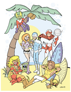
New Teen Titans Love

This gorgeous manga-esque animation style
redesign of the team seems similar to the art style
used on Teen Titans Year One from a few years
back, with the ages of the characters of course
advanced significantly.
(I did not find an artist credit, tho.)

Just a nice, sleek, smooth design that I
think really expresses the heart of the characters,
as well as a fun and bright showing of similar times.
(Except, of course, Donna should have an
actual waist and ankles!)

***

DC Fifty-Too (Teen Titans)

There was a wonderful call-to-arms by an
innovative bunch who decided that DC's
'new 52' was a good idea...if not thoroughly
as diversified as DC itself promoted.

So, to take up the slack, a blog was started
to expose fans to the extraordinary talents
of many alternative and Indy artists who are
not currently being employed by DC.

What If...the new 52 were truly innovative?
You'll be amazed by the results, such
as the Teen Titans sample cover and
redesign by Tim Seeley, pictured above.

See all the great work at:
(recently renamed blog!)

***

Bill Walko's Titans

Here are some incredible re-creations/interpretations
of my favorite eras of the Teen Titans!
The artist extraordinaire is Bill Walko,
and you can find more of his sublime Titans--
and other brilliant work--at